The Blast from My Past Mind Map!
Time is Fleeting!
This Mind Map drew my attention the very first time I saw it. Mind Maps often draw us in because we have a personal reaction to the Central Image or something contained within it.
Personal Attraction
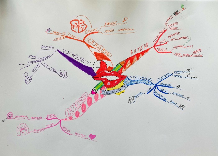
This was particularly so with this Mind Map as the central image a beautiful complex composite of some fairly simple images reminded me strongly of the poster for “The Rocky Horror Picture Show” which was one of the first West End musicals that as a young dyslexic Stage Manager, I was in wholly in charge of
I am sure that the competitor had no idea of my theatrical history but it did make me very keen to dive deeper into this particular Mind Map.
A compelling Central Image will do that! It's the equivalent of beautifully executed cover art for a new novel. As much thought planning and design goes into the cover art as goes into the narrative. You should consider your Central Image to be the cover art of your Mind Map and the more unique, interesting, outstanding, and compelling the image the better and more memorable it will be
The branches on this Mind Map are very strong. Each branch has a distinct and different colour and feel, although the orange at 11 pm sitting next to the red at 1pm could be confusing as they are so similar. I perhaps would have chosen a green or another colour to differentiate the branch more clearly - but really, this is true nit-picking and a very minor point!
The Mind Map is however perfectly balanced. There is a strong Central Image, distinct Main Branches that ripple out through themes down to details. It shows great confidence in tackling one of the most difficult disciplines in the World Mind Map Championship line-up and doing so with aplomb!
As a tweak for next year's World Mind Map Championship I would like to see the main words on the main branches made slightly larger and more outstanding and distinct. The competitor could play with different fonts, different lettering styles or animate the words by making them 3D or suggesting movement in some way.
You can find many hints and tips for how to work with lettering if you look at comic books and poster designs. Nothing in Mind Maps is unique, everything is borrowed from other art forms, everything is borrowed from other Mind Mappers!
I know in school that this would be called “cheating” but in Mind Mapping and accelerated learning this is called modelling and it's something to be greatly encouraged.
I would like to see more made of the images in this Mind Map. They are rather small and discreet, almost timid in their execution. Next year I would like to see the competitor make more of their images, making them multi coloured instead of single coloured and therefore making them much more memorable.
But this is a strong, competent Mind Map made by someone who is very confident with the laws of Mind Mapping. Over the next year I would like the competitor to focus a little more on the creative inputs to left this Mind Map from being a very competent Mind Map to be truly World Championship Mind Map.
This Mind Mapper could be one to watch in the future!

This is a strong, bold and confident Mind Map with a very nice central image.
Basic Ordering Idea Branches
I’d like to see a little more curvature – The red and purple branches are too straight. They are nicely patterned which is good. Starting to show variation of lettering styles.
Use Colourful Images
Remember that images do not have to match branch colour. In fact, it is encouraged to draw images with their own natural colouration so they stand out. This improves recall dramatically. It is also more creative and aesthetically pleasing. It started OK with the green fir tree but seems to have been quickly abandoned. The eye on the pink branch could have been blue, brown or green with black lashes. The archery target could have been yellow red, blue and black. As this is a live Mind Map of the talk, I appreciate it is not easy to draw beautiful images and keep switching pens whilst listening. One solution is to leave a blank branch with a mental note of the image you want during the talk and draw them in during the 20 minutes of ‘tidying up’ time. They could be a tad bigger too.
The orange brain is a bit big. Even though the left hemisphere has an arrow pointing to the word ‘gauche’ the image itself is largely floating. It should be sitting anchored to a branch.
The Mind Map nicely fills the whole page and is well spaced.
Truthfully, there is relatively little room for improvement. Keep up the good work.