The Animated Human Mind Map
Humour improves recall - fun is important!
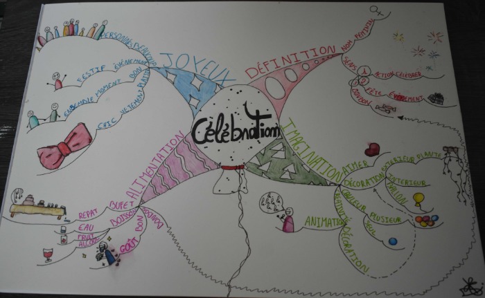
Central Image
I think that the Central Image is a little on the large side in this Mind Map. Because it is very monochromatic it also doesn't become the principal focus of the Mind Map - the Main Branches seemed to take over instead. I always think this is a missed opportunity for creating a truly memorable Mind Map.
I think this could be improved by making the balloon more colourful and perhaps animating it. Check out paper Comics and animation videos on YouTube for how you can make images appear to move on your Mind Map… it's a really neat trick to learn!
I'm also not a fan of using the word on the balloon. The best Mind Maps have compelling images as their Central Image and this feels too much like a cheat using the word within the balloon in order to get around the “Mind Map Images should not be solely words surrounded by boundaries” rule.
It seems to me that the words are just a little bit redundant - in fact, I would have marked the Central Image higher if the word had been omitted!
Main Branches
The main branches are far too chunky. They are very nicely patterned that does make them very distinctive and individual.
A Mind Map should contain between 5 and 9 branches. This Mind Map has 4 branches and in reality, there is no space to add additional branches for another line of thought or to add any extra information.
For the 2022 World Mind Map Championship, I should like to see this competitor keep the beautiful patterning but slenderise the branches a little and make them more organic and less static and clunky.
Images
There are more than 10 Images in this Mind Map which means that it makes the maximum amount of marks in the World Mind Map Championship according to the Paris marking scheme.
I am a particular fan of the animated people images that this competitor has included within their Mind Map, they are very engaging and humorous! Anything that makes the reader smile or laugh along makes the content instantly more memorable, please keep including this kind of image. They are a pleasure to read and we would love to see more!
All of the images are nicely executed and in full colour, the one tip for next year would be to make sure that the images are not too large when they are at the periphery of the Mind Map.
The ribbon bow at 9 o’clock on the Mind Map is rather large and distracting and draws the eye because the Central Image is not punchy enough - be careful that what you draw and the size you create it does not draw attention away from the main theme of the Mind Map.
Words
The keywords are very clearly defined with each main branch having a separate colour.
There is a great use of changing fonts on the main branches, this is often overlooked by many people who Mind Map. This can really increase how much information you can recall because the brain loves variety, it craves novelty.
The one tweak I would give for next year's Championship is that the keywords all appear to be roughly the same size once you get past the main branch titles. A great habit to get into is to gradually decrease the size of the words as you move towards the periphery of the Mind Map showing which is most important (large words) and what are details (small words)
Connecting Arrows
There is only one connecting arrow on this Mind Map but it is correctly deployed - full marks! However, I don't think the frenetically wavy line improves the understanding of connection or of tying of the two themes together. I would prefer to see a bold, direct, multi-ended arrow instead.
This can seem a little daunting to draw, I recognise that! You can practice by creating sweeping sweeping arrows in pencil to give yourself a guideline before inking in
Next Year!
Next year I would like to see a little more detail on this competitor's Mind Map - going down perhaps another Level or two.
If the main branches are made much less chunky, that will allow for plenty of breathing space between the branches and even with much more detail, it will feel much less congested.
I love the style of this competitor's Mind Map, a clear distinct style with a great deal of humour - they are talented, very talented!
I do hope to see them in the 2022 World Mind Map Championship as I think with a few tweaks they could be a medal contender.

This is an overall very nice Mind Map. I have a few pointers I can add in addition to Elaine’s insightful comments.
Text on the main branches is clear and sufficiently sized to be impactful. I might have slightly reduced the size of “JOYEUX” to match the other branches but that’s being a little picky.
Branch Length
Take care with the length of branches. There are a few instances where text has had to be squished up to fit a too-short branch. I am looking at “ANIMATION” and “PLAISTE”. Of course, on the left of the Mind Map you can’t extend a branch which turns out to be too short. If you struggle to estimate the right length of branch to fit a word you can, in some instances, write the word first and then draw the branch.
Branch Colour
Text colour should match branch colour. We often see text written in black on coloured branches thus deducting marks. This is usually a consequence of having too chunky pens to write clearly. However, in this Mind Map the opposite is true. There are black branches with coloured text, so in the same sentiment we would have to deduct points. Use of colour is often seriously misunderstood. People talk about beauty, nature, artistry and other such sentiments. Colour does indeed add to the visual appeal of the Mind Map, especially in combination with images, and stimulates creativity. This is not its only role though. Colour acts as a chunking mechanism. It ties together the elements of each branch and its descendants. This assists memory considerably. Hence the importance of matching branch and text colour.
Upside Down Text
“BonBon” on the lower left pink branch is upside down. Always make sure that you do not need to rotate the page to read the text on a branch. This interrupts the immediacy of being able to take in the Mind Map as a whole. The branch could have curved in an elongated ‘u’ shape to the right allowing the word to be written right way up. Also, if the main branch was thinner and more curvilinear there would have been more space for the second level branches. As is often the case, slight issues in one area tend to have consequences ‘downstream’.
Fix these small issues and you will have a superb Mind Map. I’m looking forward to what this competitor can do in 2022.