Mind Maps should connect to the Universe!
Everything connected to Everything Else!
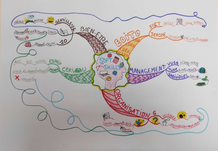
A well thought out Central Image, representing all the soft-skills that we could be focusing on developing.
Chose Words Carefully!
I feel that the words may be unnecessary - that the images inside the skull are more than enough to convey the purpose of the Mind Map without having to resort to writing.
I also feel this Central Image would be more effective if the competitor had not surrounded it with a boundary (the wavy yellow and green line) In the Paris Marking Scheme - the last marking scheme worked on my Tony Buzan before he died one of the point she stressed was to not “enclose” a Central Image in a box, bubble or cloud. Tony felt that the Central Image should be left open to allow the brain and the Mind Mapper to continue making connections to it in perpetuity.
More Elegant and Organic
The Main Branches - well I’m afraid this is another example of them being simply too heavy and chunky .. but that is easily remedied next year by making them slightly thinner and a little more elegant and organic. They are however nicely spaced around the Mind Map and it shows that the competitor has put a great deal of thought into the content they wish to display.
They are also clearly differentiated - each is a distinct colour, with a distinct pattern and a distinct choice of font in the primary keywords.
This Mind Map clearly shows the differentiation between the most important concepts (the Main Branches) and therefore in large font and the details - out towards the side of the Mind Map and therefore in smaller font size.
I particularly like the choice of different font styles and sizes when it comes to naming the Main Branches - they are very well done.
Close to an Important Rule
This competitor sticks closely to the rule “each word and branch should be the same size” another rule that Tony Buzan specified in the Paris Marking Scheme. This is good practice in Mind Mapping and again helps the brain create a hierarchical memory plan of the Mind Map during the review process.
Perhaps I would have liked a little more content and personal reflection to the content covered - a chance for the Competitor to show their understanding and personal viewpoint on the Soft Skills topics. This would have taken this Mind Map into a higher marking category by the Arbiters.
Fantastic Images!
There is good selection and a good number of images within this Mind Map. They are carefully chosen, curated and deployed. They serve to highlight and inform the reader not just to illustrate the Mind Map - in this area the competitor has done a remarkable job.
The one downside - those loopy, meandering indistinct connecting arrows. I find them too distracting and not informative enough. The aim of the arrows is to clarify that there is a connection and directly show that - the wandering nature of these connections looks artistically pleasing but is not so effective as something more direct.
The multiple looping connections also serve to enclose the Mind Map in a distinct container of its own. It leaves no space for additional information to be connected or additional branches to be created.
Consider this” No Mind map is ever finished! It connects to every other Mind Map, every other thought, every other person in the Universe!”
At this level (and this is a very high level Mind Map) I would love to see space left for additional connections, collaboration and community .. so no restrictive boundaries.
But this - I would show this Mind Map as a very great example of a Mind Map in any of my seminars .. I wonder if the competitor will be chasing a medal next year?

This is a very accomplished Mind Map but could be refined in a few areas.
Try Codes and Fewer Arrows
Not only are the arrows too looped and wiggly, they are also long (as they connect ideas on opposite sides of the Mind Map). This in itself is not necessarily a problem but it can start to restrict other branches and look a bit like spaghetti. Consider using perhaps one long arrow and show other linkages with code icons. This can be equally effective and leaves the Mind Map with more clarity and elegance.
Think About Sub-division of Branches
There are a couple of instances where the competitor has run out of space so had to double back to fit in a branch. This disrupts the radiant flow. There seems to be a tendency to bifurcate, or occasionally split into three, at the second level then continue out four or five more levels without spitting further. This is almost sentence-like. More branching on the same level but less levels would lead to better thinking and use of space.
Always try to be as succinct as possible. On the green branch use of ‘il faux’ and a cross is not necessary. The cross alone would have sufficed and there would have been enough space.
Take Care with Branch Length
In a couple of cases words have spilled off the ends of branches. This has happened on the left where of course you can’t extend a branch if you’ve committed to making it too short. Always think about the word before drawing the branch. It should be obvious that a word like ‘neuroscience’ will need a long branch. If you struggle to estimate the correct length of branch it is permissible to write the word first and then draw a branch under it. If doing this though, make sure you write the word in a flowing curved way so you don’t end up with lots of straight branches.
All these are small, picky changes which differentiate a very good Mind Map from a great one.