Isn't this a Joyous Mind Map?
Loving the style!

Isn’t this joyous?
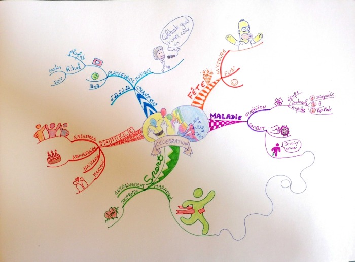
This Mind Map has an amazing Central Image - seriously scroll on in for a closer look and see how the competitor has utterly demonstrated the idea of “Celebration” in one joyous Central Image.
In fact - there is a great use of images throughout this Mind Map although they do get very small very quickly. For next year I would like to see this competitor focus on making the important images “pop” from the page and really grab our attention.
You can look to cartoon or anime illustrations for many ideas of how to make important points really jump from the page and really grab your reader's attention - its amazing the techniques you can gather when you look at other people using visual note-making means to communicate with us, There is a whole subculture of recognised shortcuts and ciphers many of what can be appropriated for Mind Maps.
The Mind Map is very balanced on the page - it flows into all four corners and all four edges. There is a good amount of “negative space” which really helps with clarity and subsequent recall - and also stops you from feeling overwhelmed at the amount of content on a page.
Focus on Size Too!
I feel that more could be made of the hierarchical progression of sizes in relation to the keywords - the keywords on the Main Branches could be beefed up a little and made more prominent and that then leaves plenty of options to make all subsequent keywords progressively smaller as they flow out and down to the details. This helps us differentiate in our brains what words are more important and therefore where our focus should be.
Main Branches
The branches have a great distinction between them, however - each is very obviously a separate colour and the patterning on the Main Branches help to support this distinction too. A tip often overlooked is that the choice of a different font or writing style on Main Branches can also help to create this distinction - I am heartened to see that this competitor has also woven this into their Mind Map.
There is a connecting arrow - showing how two thoughts or themes are connected in reality. I remember marking this Mind Map in the Championship and deciding not to mark it down as a “meandering arrow” as an arrow taking “the long way round” may be considered appropriate when the principal theme is Marathons LOL. However, mostly we coach against meandering arrows as they should directly show the connections between two points as concisely as possible.
Picky! Picky!
If I was to be incredibly picky about this Mind Map - I would suggest that the competitor shows off even more of their intelligence next year by incorporating just a few more details and more personal attributions to the topic being explored. It feels very much like a list until personal reflections are included, questions are asked or answered and the personality of the competitor shines on through.
Mostly though - I love this! I would not be afraid to display this Mind Map when anyone asked “give me an example of a good Mind Map” …. The competitor should be very proud of the standard they have achieved .. especially when done so under Championship conditions!

Overall I am impressed by the Mind Map and have to be very pedantic to be able to suggest improvements beyond the points Elaine has made.
Speech Bubbles and Synaesthesia
If Tony Buzan was marking this he would have originally heavily penalised the use of speech bubbles. We now take the view that direct quotes in bubbles, as a slight bending of the rules, is acceptable if used sparingly. I think we pretty much won Tony round to this too. Certainly it’s acceptable under ‘musique’ as I can hear Kool & The Gang singing ‘Celebration’ in my head (I forgive you for the ear-worm). It’s a great example of synaesthesia, evoking sound. The bubble is nicely connected via the microphone lead so it is still associated. The marathon runner breaking the tape has an energy about it and the heartbeat is also nice. Both give a physical synaesthetic feeling.
Originality
Your own unique images are great. It is best to avoid copying other’s creations unless you have a good reason. Not only does this score higher in terms of originality in the Championship it keeps you squeaky clean in terms of copyright. Homer Simpson is heavily protected in intellectual property law. Even the phrase ‘D’oh’ is a trademark of Fox. Being inspired or influenced is fine.
Printing
It is OK to use lower case text on the periphery as the competitor has done but care should be taken that this doesn’t creep into joined up handwriting (unless done on purpose in a particular instance for stylistic reasons). The brain finds it easier to mentally ‘photograph’ clear printed lettering.
Very well done!


