Connecting Arrows should clarify your Mind Map not confuse!
Simplify and clarify!
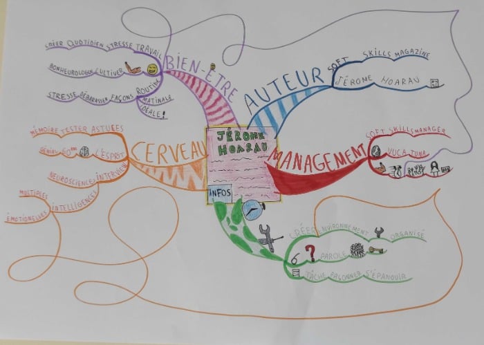
This looks to be a Mind Map from someone very confident and competent about their technique and is now exploring to find their own “style”
Yes! Like our handwriting is all different, so too our Mind Mapping styles are beautifully and creatively varied. In fact, you can begin to recognise your friends and colleague's Mind Maps in the same way that you would recognise their handwriting.
Compelling Central Images
Looking at their degree of understanding of the rules of Mind Mapping I would perhaps like to tweak the Central Image a little. I feel that this could be a little imaginative and compelling.
If you regard the Central Image as the title of your Mind Map, you are looking to create some scroll-stopping cover art as your Central Image to make you stop and draw you in.
Tony Buzan used to talk about how a great Central Image would actually stop you walking and make you move in closer if the Mind Map was displayed as a piece of art on a gallery wall … this central image just tends a little too much towards the ordinary to be truly outstanding.
Refine the Branches
I find the main branches are a little too chunky. I have noticed that this is a common trait amongst many new Mind Mappers and can only assume that somewhere out there there is a Mind Mapping Coach who is teaching this as the “proper way”. Were these main branches narrowed by about 30% I would judge them as utterly perfect and balanced!
There is however a massive degree of competency displayed in the Mind Map. The keywords are well-chosen and the sizing of the words - from large to small is clearly differentiated and enhances understanding of principal points and details.
The Mind Map is liberally peppered with images - carefully selected and elegantly executed. Although we look for a minimum of ten images on each Championship Mind Map for full marks .. more images are always better in my book!
Amazing Images
The loopy arrows, however - elegant and artistic as they are, serve only to confuse the mind when trying to make the connection between similar themes. Arrows are extremely important in showing cross branch connections, recognising similar themes, and connecting thoughts .. but the multiple loops and changes of direction on these arrows swerve to confide rather than clarify, so next year I would like to see the competitor simplify these a little.
All in all - a remarkably competent Mind Map of a whole publication under Championship conditions - very well done X

This is a very competent Mind Map. I like the patterns in the main branches with coloured pencil shading. (as Elaine mentioned they just need slimming down)
There is little to add to Elaine’s insightful comments. I just have a couple of other observations.
Images
Images on a Mind Map are the prime elements in making it memorable. It is a shame if they are a struggle to see. Make the images a bit bigger and bolder. Not too much, but enough to make them stand out. The question mark on the green branch is about the size I’m thinking of at least.
Text Colour
Text colour should always match branch colour. This leads to memory chunking and ties together elements on a set of branches. Avoid black or grey text. The green branch should have green writing and the pink / purple branch should have purple writing. Elsewhere is fine. The omissions could be due to a lack of fine enough pens to write clearly. Invest in a good set of fine-liners.
Overall a good job. Well done!