A more powerful Central Image to the Mind Map?
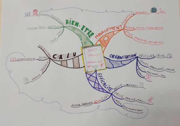
This is a Mind Map from the written text category of the world Mind Map championship. Competitors are provided with an unpublished piece of text and within the competition framework and are expected to Mind Map the text in its entirety. Showing the width and depth of understanding that they have made.
This Mind Map nicely inhabits the whole page with the content running evenly out to the edges. Balance is important aesthetically.
Central Image
However, I feel that the Central Image is a little ordinary for a Championship Mind Map. I would like to see something a little more creative and outstanding. After all, the rules of the World Mind Map Championship states that the Mind Map Central Image is a captivating and engaging image, not just written words.
We know from lots of research that one of the secrets of a memorable Mind Map is the truly captivating central image, one that sticks in your memory long after you have viewed the mind map.
Next year I would like to see this competitor spend just a few more minutes to create something much more memorable.
Main Branches
The relative timidity of the central image becomes more apparent when you contrast it against the main branches.
- Yes, the main branches are clearly defined.
- Yes, the main branches are very different colours.
- Yes, the text on the main branches is large and clear.
However, the size and chunkiness of the main branches rather overpower the timidity of the Central Image. For preference, next year I would like to see this competitor work towards making the Central Image the principal eye-catching section and the main branches slightly less so.
This could also be achieved by making the main branches slightly less chunky and more slender and organic.
Images
The competitor has hit the target of at least 10 images within the body of the Mind Map. Personally, I find that the images within the body of Mind Map are much more memorable when they are created in full colour. One colour “icon” images are inherently less memorable and therefore less effective.
However, the images are charming. They are fun, relevant and add to the understanding of the Mind Map as a whole. You do not lose Championship Points in the World Mind Map Championship for not creating full-colour images, so this is perhaps just a Senior Arbiter being incredibly picky with a very talented competitor.
These coaching points are meant to lift you up, to encourage you to become 1% better in every area of Mind Mapping. Please never think that I would ever run a Mind Mapper down, that is never my intention.
I actually find this Mind map incredibly effective. It has captured a large range of the data within the magazine in an interesting and innovative way.
Arrows
If I was to be incredibly picky, I would like to refine the connecting arrows on this Mind Map to make them less meandering and loopy. Arrows on a Mind Map are for showing the connection of related ideas. I find the back-skipping and looping slightly distracting and confusing when it comes to creating a strong memory trace.
But these are tiny points! Points however that could end up with this competitor being in a medal ranking position in the 2022 World Championship. I can't wait to see how their Mind Mapping has evolved between the two competitions.
See you in 2022