A Mind Map of Bobbing Balloons and Bunting!
Memories of celebrations past!
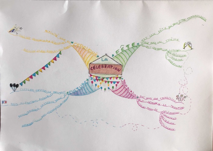
This is a really cute Central Image! I think the bunting and balloons are very nicely executed. The Central Image is the right size and of course right in the middle with at least three colours so it gathers all the points it possibly could in the World Mind Map Championship scoring system - The Paris Marking Scheme!
Animate!
If I was to be very picky and coach this competitor I would ask them to look at animation practices and see how the balloons and bunting could be made even more exciting by “animating” them. Just a few strokes of a pen could make these balloons bob in the sky and the bunting flutter in the breeze!
For next year I would like to see the competitor focus on showing the difference in importance of the Main keywords on the main branches vs the details towards the outside of the Mind Map by showing the gradation in sizes. The principal keywords in the middle should be big and bold and the details on the outside should be much smaller (even lowercase if that is needed). In this Mind Map the words on the secondary branches are all much of the same size.
Refine the Branches
I find the Main Branches to be far too chunky, heavy and static. The Main Branches do not need to fully enclose the Central Image they just need to connect to it cleanly. These heavy Main Branches almost makes the Central Image feel constricted and restricted - there is precious little space to go back to the Mind Map and add an additional branches if needed to explore the principal themes more deeply.
Overall though, this is a very balanced Mind Map with the keywords carefully chosen and carefully considered.
Dotted Connections!
The one technique I really don't like on this Mind Map is the indistinct, dotting, meandering connecting lines. They do nothing to clarify the points being connected, they do nothing to immediately signify that the two points should be directly connected it adds nothing to the value of the Mind Map
If the two points had been directly connected with a bold arrow, perhaps even a multi directional arrow, the association and connection would be much more clearly represented
We have seen this on a few of the Mind Maps during this year's Championship and it's interesting how various permutations of the Mind Mapping Laws come and go in different years
However at the World Mind Map Championship we are aiming to create Mind Maps that are as close to the laws of Mind Mapping as set out by Tony Buzan in the Paris marking scheme. To this point these pretty, but ineffective, dotted ,meandering connections are something we will not be encouraging.
Easy Championship Points
My last coaching point for this competitor for next year's World Mind Map Championship would be to look at incorporating more images within the body of the Mind Map. We know that "a picture is worth 1000 words" and the rule - as per the Paris marking scheme - is that a championship Mind Map should contain at least 10 images within it. Each Image is worth one Championship Point!
This competitor has very clearly executed the few images that are there. I would just like to see the competitor not lose marks by not making sure that at least 10 images are in next year's Mind Map
All in all, this is charming! It evokes a feeling of celebration and a warm recognition of celebrations past and present. I look forward to seeing what this competitor could do in the 2022 World Mind Map Championship .,

The Mind Map has a nice sense of genteel fun. Although French, it had a feeling of an English country show or school fete with the balloons and bunting. A little twee but in a charming way.
Shading and Patterns
The main branches are nicely shaded with coloured pencils. It has a little variation in density of shading but if this were to be done a bit more it could give a pleasant 3-D effect. There could be more variation of patterns used on the branches too.
Colour
Yellow is a good colour for highlighting, adding emphasis or colouring in images but shouldn’t be used as a branch colour. It is very hard to read and gets lost against white. The pale blue and, to some extent, the green are a little muted too. I think the Mind Map needs more oomph. Fine-liner pens with intense colours would solve this.
Take Care with Keywords
Keywords on the Mind Map should be mostly nouns and verbs. There is no need for prepositions, pronouns, etc. The competitor has used ‘de’, ‘de la’, ‘une’ and ‘un’ which are superfluous.
There is some nice energy with the shooting stars, clinking glasses and exploding popper. I would like to see more and bolder images.
Looking forward to more from this competitor in 2022.